So before I start.. What ya'll think about the new blog name? I kinda like it.
Aight so I've officially run out of Oscar nominated movies to review. And I keep trying to watch Valentine's Day but no girl wants to be seen with me in public, so I thought it would be cool if I start reviewing short films as well. I'll even embed the short films at the end for you're viewing pleasure. Thanks guys! Ya'll are awesome and I really appreciate you're readership.
Logo...Rama! Holy shit was this movie the fuckin kick ass God of all damn Creation!
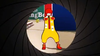
Logorama is about a day in the life of crime and crazy in Los Angeles. It's about these bunch of random characters who's lives all collide when a psycho gunmen in the form of Ronald muthafuckin McDonald is on the loose and the streets of Los Angeles becomes the playground of one heck of a police chase.
Logorama is a lot like Pulp Fiction but as told using advertisement images. Everything in Logorama, the characters, the buildings even the sky are made up of ell known brand logos, corporate mascots and advertising images. And there are thousands of them appearing in this. Watching Logorama was like being bombarded with a whole lot of product placement, which I think is the big joke of the film.
Logorama takes a huge stab at the ridiculous amounts of product placements in films and how most movies would intentionally stop the plot of the movie to flash some screen time for their advertisers (i.e Percy Jackson) Logorama takes product placement to the extreme here, every second you're eyes are going to catch a familiar image or character but it's blended in so well with the story you would have to rewind it back just so you can see it again.
It also has a lot to do with how much media advertising and corporate images have become embedded in our subconscious and culture. I bet any 4 year old any where in the world can identify Ronald McDonald or Mr. Potato or the Michelin Tyre Guy over the Pope. It's kinda scary really if you think about it that the media can control the things we know and are familiar with. But then again it's good for me since I'm going to take over Rupert Murdoch soon muahahhhaa.
And did I mention how kick ass the action in this movie is? The pacing of the movie is just one hell ride after another I can't barely catch my breath will all the gore and car crashes and deaths of many many familiar advertising characters. This is not a kids cartoon. It's really violent, really bloody, has lotso f words and has a psycho clown.
The highlight of Logorama was Ronald McDonald who is this crazy gunmen who's just going around Los Angeles killing anyone he sees. Trust me, after watching this, you don't even wanna sit next to the guy on those McD benches anymore. This guy was like The Joker.... but scarier.
So I'm embedding the show at the end of the review, please please please watch this people. It's going to be the greatest 15 minutes you will ever witness in your goddamn life!
RATING: 9/10


8 comments:
download valentine's day la!!
and why no girls wanna be seen in public with you?? your creepy is it?
Wow...this sounds like a very special movie. So different. :)
Believe in yourself. :)
the setting looks as though all things media blew up and created a city. lol. but it does reflect how it's like in advertising today. :)
I can't begin to tell you how much I hope this movie loses. It has the Oscar pedigree of mixing "violence" and "cleverness," but it's not nearly as clever as it thinks it is. The first half of the story has nothing to do with the second half of the story, so the writing is for crap. The logo thing is nice, but the logo-to-actually-interesting-use of the logo ratio is really thin. To say that the language and violence is gratuitous doesn't begin to cover it. To say that the use of the logos is some kind of "allegory" for modernity gives it so much more credit than it deserves.
Wow! Thank you for this template... web application
I enjoyed this movie but your review is a bit over the top. This short film has an interesting concept but it is slightly chaotic and the cell shaded rendering has its pros and cons where visibility is concerned.
You state that the movie is like Pulp Fiction, but there were few witty exchanging. Maybe you were referring to the incessant use of profanity, not the presence of wit and charm in the face of a chaotic world?
Decent short. Poor review.
Yeah I think I was a lil too into the short that I gave it a too high rating. Rewatched it again after your comment, totally agree with you
Post a Comment